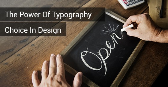
Typography is an art and skill that combines visual performance and readability to communicate to your audience effectively. It can become the focal point of your message, helping to set the right mood and convey a certain message to a specific group of people. Here are a few tips to maximize the impact of your sign using typography.
Learn the Basics
To create a unique project, you need a good understanding of the key elements. When it comes to utilizing typography within your design, you need to be familiar and comfortable with several aspects of the craft. You need to respect the typeface anatomy, which comprises general standards, precise measurements, and very specific jargon. As with many skills, you can only break the rules and still achieve a favourable result if you know what you’re doing, and are deviating from the norm with a specific purpose.
Take some time to browse through a typographic glossary and learn as much as you can about typography. As a designer who is using words to create compelling messages, it is important that you acquaint yourself with the art and science of typography.
Consider Typographic Hierarchy
Two of the key characteristics of great designs are well-organized elements and a clear line of sight. Visual hierarchy helps to establish a visual structure that the audience can use to navigate through the message without confusion.
Typographic hierarchy is a component of visual hierarchy that attempts to organize the content by dividing it into sections using headings, captions, subheadings, body copy, and so on. The differences usually become apparent through the use of font colours, family sizes, and width. If done right, the design becomes legible and easy to scan, so the viewer is automatically drawn to the most important bits.
Match the Mood to the Message
It is easy to get used to certain fonts that are more formal or more fun, depending on the context. A novice, on the other hand, may not see much difference between one font and the next. Either of these situations could cause you to miss out on the power of fonts and typography.
Every typeface creates a unique mood and appeals to a certain personality, such as friendly, serious, fancy, or silly. Most fonts cannot be used interchangeably, so you need to identify what message a specific font is giving, and whether it suits your design and your audience.
Lastly, Observe and Practice
If you are looking to improve your use of typography, then you need to be more observant and thoughtful, to try and understand why other designers use a specific type in their work. It will take time and practice to develop an eye for typography design, but it is learnable.


Leave A Comment